Storytelling with Numbers explores the foundations of financial reporting.
Is Reporting storytelling or is Storytelling reporting?
You are forgiven if you have a position either way. Delivering financials can be the mother of all stories. It is just that it uses numbers as its basis and is delivered with the medium of spreadsheets, charts and graphs. A language not everyone is familiar with.
Financial reports are stories on which the reader bases their opinions, perception, perspective and most importantly decisions.
So how do you tell a good number story? Visually, of course.
Preparing for Storytelling with Numbers
Before you start set the scene by having a good think about the task at hand. Ask yourself:
- Who are you delivering the reports to? And, what is their capacity of understanding your message?
- Which are the most appropriate numbers that are relevant to your audience?
- What is the best method to delivering the numbers?
The Audience
Let’s stop for a moment to think about our audience.
- Is it the first time you are addressing them?
- How much do they already know about the subject of your report?
- What is their financial literacy level?
We stumbled across an interesting Harvard Business Article recently that summed this up nicely. So here is how we see the different audiences:
The Non-Accountant
This can be the small business owners needing to understand their business better. Or the Board Member representing the membership base with the social cause at his/her core.
Let’s be frank, numbers don’t mean much to this audience. In fact, numbers may scare them.
What they are good at is they understand the reason for the organisation’s existence and have a dream of where the future lies.
Therefore, a long-winded spreadsheet is going to go right over their heads. And, most importantly, it will keep this audience out of a productive and meaningful decision-making process.
The Generalist
This includes the Bank Manager and many of the Board Members.
They have some business acumen but not necessarily a financial background.
Essentially, this audience understands a Profit & Loss and may even be able to read a Balance Sheet. Again, a visual chart will make the most of the Generalist’s discussion at the table.
The Expert
This includes the Program and Department Managers as well as the Finance Officers.
They live in the space of which the numbers are made of.
As part of their roles, they set the budgets in the first place and work, day-in-day-out, to achieve the set goals.
For this group of people, numbers mean something, but a nice trending graph will short-cut straight to the visibility of where things are at.
The Data
Find the relevance of data. It is about asking many questions.
- What do you want to achieve?
- And, what decisions need to be made?
- Does your audience have to make long-term strategic decisions for the future?
- Or, are we looking how things have gone in the past?
Essentially, whatever data you deliver it must relate to the outcome.
Furthermore, to be kind to your audience, you ‘dress up’ (or visualise) this data so it helps the audience get to the point quickly.
The Method for Storytelling with Numbers
Often it is not so much about the actual data but the context it references. This means that numbers are not just numbers but come to life if they are part of a bigger picture. The bank manager’s view on a loan application is limited if it is based on revenue forecasts only. But his/her view changes if this revenue is substantiated by a vibrant and dynamic organisation that shows a track-record of growth and sound financial management. Show it!
Today’s surge of infographical messages is a clear sign that data must be brought to life by colour, words and pictures to reach the intended audience.
It is about giving relevance to data.
Charts come in many colours and flavours. You can use them in a report or as part of a live Dashboard. Here are some thoughts on when to use the different types:
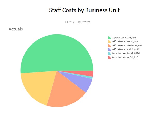
The Pie Chart
This is useful to capture an at-a-time-snapshot. They are based on an outcome at a set date.
This could be:
- Expense Breakdown for a Department or Program
- Comparison of Income Streams

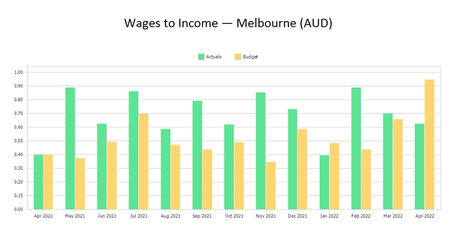
The Bar Chart
This compares multiple data across a time span and can show a trend. For example:
- Actuals vs Budgets for this month and across last 12-months
- Performance comparison of various departments each month

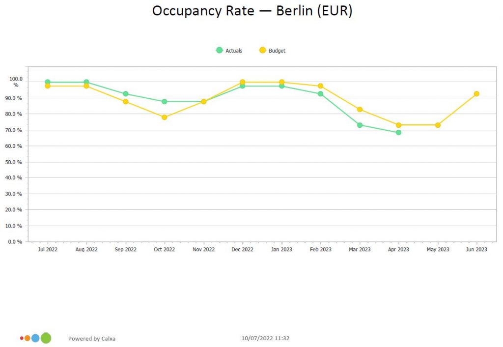
The Line Chart
This picture is great when you want to compare one trend (one number) with another. You can apply this visual to:
- Best case scenario vs worst case scenario.
- Social media performance across multiple platforms.

While complex charts are great for drilling into data and exploring the finer details, these three classic charts are a great option to communicate your findings. Nancy Duarte is an author and communication specialist and her article Choose Charts Everyone Understands explains the importance of choosing the right chart.
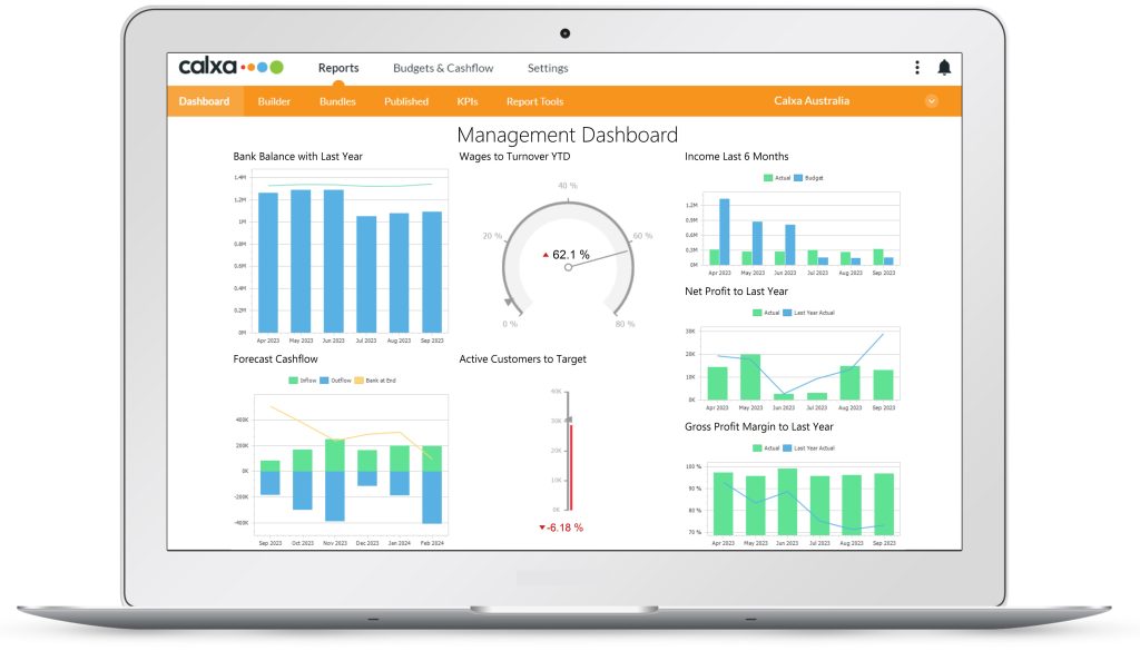
The Dashboard
Finally, most charts work really well as part of a dashboard. The advantage of a board, compared to a report, is that it can tell a story at a glance.
Mostly, the dashboard is made of single metrics or data across shorter period. For example, if you are using a line or bar chart, you would generate this across 3 or 6 months. As a result, you will help the audience to quickly grasp the impact of this data. One board can tell a story.

You can get some ideas from this article 7 Metrics for your Monthly Management Dashboard.
Importance of Relevance when Storytelling with Numbers
The most important component when storytelling with numbers, RELEVANCE. The numbers must be of interest and significance to the audience.
For example, to get a good uptake from a Board, the reports need to engage and be relevant to the decisions at hand.
To quote mathematician John Tukey, “Numerical quantities focus on expected value, graphical summaries on unexpected value.” Isn’t it the unexpected ‘what’ we want to zoom in on and investigate? This enables us to make those good decisions that are relevant, responsible, and based on evidence.
Try your own storytelling with numbers. You can visualise reports to show how your business tracks against ATO Benchmarks or to make a strong case in support of your bank loan application.
