Management Dashboards are a great way to track business performance. A well-designed management dashboard gives you a clear snapshot of your business performance, without drowning you in data. The goal is to enable you to make good decisions, faster. Naturally, metrics and dashboards go hand in hand. Presenting a set or metrics together builds a useful snapshot of the organisation’s performance. A good management dashboard will help you make good decisions quickly.
If you are a not-for-profit organisation have a look at our article on Building the Board Report Dashboard as well.
What is your Management Dashboard for?
Not all Management Dashboards are created for the same reasons. Therefore, it is important to understand the purpose and audience for your dashboard before deciding what should go on it. There are multiple elements to look at:
Strategic
A strategic management dashboard is used to look at your longer-term strategies and will include high-level metrics on the goals of the organisation.
It is forward-looking, not just historical.
Analytical
On the other hand, the analytical dashboard is suited to the detail-oriented person. Here, the content often includes lots of different numbers.
It will include lots of comparisons, either to budgets or prior periods.
Operational
In contrast, an operational dashboard is designed to measure your performance in the short term against budgets or expectations.
Ultimately, it should tell you quickly how well you are doing so that you can make decisions on what needs fixing, reacting to changing circumstances.
Tactical
For a different application, the goal of a tactical dashboard is usually to measure the performance of a plan or project. For example, it will include metrics specific to that project that provide early indicators of success or failure.
Having those measures will give you the information you need to turn around any setbacks quickly and keep the project on track.
Who is the Audience for your Management Dashboard?
Ask yourself first, “who is going to use your management dashboard?”. Will it be the CEO, the board or a department manager? After that, design your dashboard to give them the insights they need into the business. Above all, this will help them to understand their team’s performance and make decisions quickly if anything needs to be changed.
7 Metrics for your Monthly Management Dashboard
In our example, we are putting together a management dashboard for a CEO.
- The goal here is mainly operational, with some overlap with what you might put on a tactical dashboard.
- We are looking at what’s happened in the past month. For instance, the management dashboard will provide some context for that. Whether it is a comparison to budgets or last year or looking at trends.
This is what this dashboard would look like in Calxa.
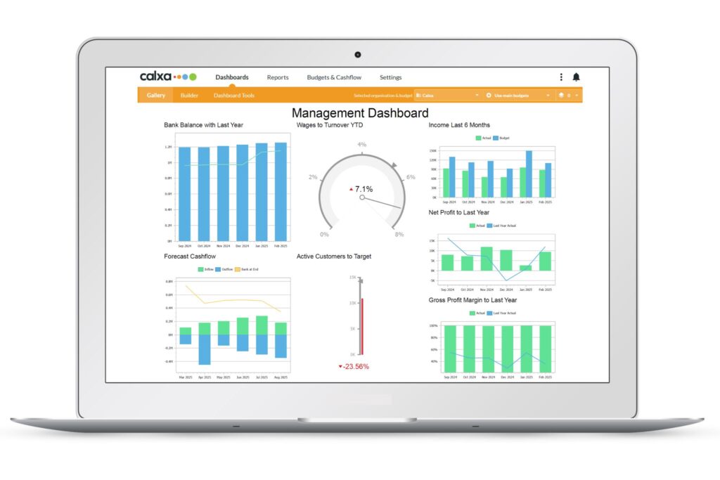
Metric #1: Bank Balance for Past 6 Months
Past behaviour, as any scientist will tell you, is no guarantee of future behaviour. Yet we all still expect the sun to rise each morning! Seeing the trends in your bank balance over the past 6 months can give early warning of cashflow problems.
- Is the balance rising or declining?
- Is that normal for your business at this time of year?
- Is this a seasonal or structural issue that you need to address?
Metric #2: Forecast Bank Balance for the Next 6 Months
The historical bank balance is clear and factual. It is what it is and it’s not open to interpretation. However, our CEO needs to look forward and to ensure the business has enough cash to meet its needs. If you have done a good budget and incorporated reasonable assumptions, it will give you a sensible guide to the next few months. Knowing of upcoming problems early facilitates action to avoid them.
Metric #3: Revenue Compared to Budget
For most businesses, revenue is a key driver of success. On the other hand, that might be different in a charity or not-for profit where Expenses may be the most variable item.
Comparing your income to budget tells you how well you are doing. Furthermore, it can also reveal flaws in your budget assumptions which can feed into your cashflow forecast. Review the figures regularly to stay on top of your plans.
Metric #4: Wages Compared to Revenue
For many businesses, the biggest expense is people. You could compare the wage and salary costs to budget. However, showing it as a percentage of revenue on your management dashboard gives a clear idea of whether changes in these costs are aligned to changes in your income. When these drift apart, there can be cashflow issues. Use this information to guide decisions on recruitment, understanding when you have the capacity for new people.
Metric #5: Gross Profit
If you’re in the business of selling things, whether you make them or buy them in, then understanding your gross profit is vital to success. Maintaining or growing your Gross Profit will provide the funds to cover your overheads. Price increases from suppliers can easily eat into your margins. So, having this on the management dashboard allows you to watch this carefully.
Metric #6: Net Profit
For long-term survival, every business needs to make a profit. It may not need to be very big but that’s better than a loss. Consistent losses will need to be made up by loans or investment to avoid insolvency. Short-term or seasonal losses are common in many industries but the overall trend should be towards profitability. Watch your net profit closely and take action before you have problems.
Metric #7: Active Customers
Now, this metric could be swapped out with any key number for your organisation. But it should go onto your management dashboard.
What do you measure to know you are doing well, that your business is successful?
For example, the number of customers is a good indicator for many businesses. Especially those who trade online. It is an important driver of your revenue and you want to see an upward trend for growth.
Now Share your Dashboard
To make it easy for the management team to use the dashboard, send them a public link so they can access it any time, even on a phone, without having to log into the Calxa app. This help article will guide you to setting this up.
Management Dashboards in Summary
Including these 7 metrics, or similar ones, on your management dashboard will guarantee you a concise snapshot of your business. It doesn’t mean you can’t go and look at other more detailed reports. In fact, the management dashboard’s job is to highlight anomalies. After that, it is up to you to find the root cause and then take action.
Your management dashboard should help you answer one simple question, “Do I need to act? And if so where?”
To get a better idea of how dashboards can fit into your reporting regime, we compared Dashboards vs Reports in this article.
The management dashboard will start great conversations with your team and give them the tools to make the right decisions at the right time.