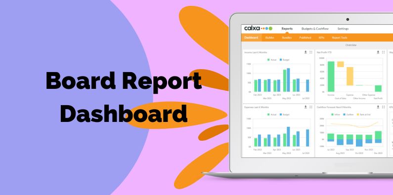
Dashboards are a great way to add a set of charts to your management reports. A well-designed board report dashboard helps directors quickly understand the main drivers of the organisation’s success. They will be able to see immediately how things are progressing against budget, any cash flow risks and key drivers. They can then move on to the more detailed reports where they are relevant.
Calxa has pre-set dashboards but also allows you to build custom insights with your own data sources and charts. These can be based on either accounts or non-financial metrics.
When to Choose a Dashboard
Favourited by many industries, this article, for example, outlines the benefits of displaying marketing data as dashboards.
If you’re not sure when to use a dashboard, check out our article comparing reports to dashboards. They are generally good for a quick, high-level snapshot, bringing related information together on one page and provide a good discussion focus for board meetings. Detailed reports make sense for those board members with the time and skills for more in-depth analysis.
Income and Expenses on the Dashboard
Board members always want to know how income and expenses are going relative to budget, or to the previous year. Use one of the Account Movement data sources for your dashboard and filter each chart for the account types you want to include.
Generally, a Not-for-Profit board are more likely to be interested in Income and Expenses. However, in a small business, Cost of Sales could be key.
Importantly, you can choose the data to include. It’s often useful to show the budgets and actuals for the current year as columns with a line for the previous year numbers. Being consistent with this, makes it really easy for your audience to understand what they are looking at.
To prepare your budgets, there are several apps on the market to help you implement an efficient process. Have a look at some of our thoughts outlined in this article Budgeting Apps for Not-for-Profits.
Cashflow Forecasts on your Board Report Dashboard
Your board is ultimately responsible for confirming that your organisation is solvent. The best way to do this is to review a forecast of future cashflow. That will tell them whether you are capable of paying your bills as and when they are due and give early warning signs of risks.
A forecast that shows your cash going below zero isn’t evidence of insolvency on its own. However, it is a strong indicator of potential problems. Subsequently, board members will want to know there is a plan in place to deal with the shortfall.
The cashflow forecast data sources have fairly simple column values and mostly you will use:
- Inflow,
- Outflow,
- And, Bank at End.
The stacked bar chart works well for the inflow and outflow, keeping one above the other. Show the Bank at End as a line and your board will clearly see where it’s going up and down.
Making this chart available on the board report dashboard gives your board members an instant assessment of the current and expected cash position and will help them sleep better at night!
Using KPIs on your Dashboard
Every organisation has numbers that drive its success. These are the numbers you watch to know how well you are doing or to predict how well you will do in the future.
For Example:
- They could be classic ratios like Gross Profit Margin or Wages to Turnover.
- It could be the number of new leads or prospects this month that indicates the value of your sales next month or the month after.
Gauges are great for showing a snapshot of a single KPI compared to budget. Use them for the big, important numbers that you want your board members to notice. On the other hand, use the card option for a collection of related KPIs. On our default dashboards we use a gauge to show Wages to Turnover as that’s a key number for many businesses as well as NFPs.
Arranging your Board Report Dashboard
Dashboards are graphical, they are visual. Ultimately, you have control over the size and layout of each of the tiles so use this to amplify the message you want to give your board. If cashflow is problematic over the next few months, enlarge the cashflow forecast so that it catches the eye and your board members can’t avoid looking at it.
Think of what your audience needs to learn from looking at this board report dashboard. It’s not just a set of pretty images. It’s important information about the business that will help them make the right strategic decisions going forward.
Watch this video to see Pre-set Dashboards in action.
