In business there comes a time when facts are required to get down to the nitty-gritty conversations. Whether they are KPIs, financial figures or performance statistics, using numbers helps us to understand situations and make recommendations as to why they have behaved this way and how to fix it.
This is where you come in. By watching trends and cycles you can plan and react accordingly; however, sometimes there needs to be a conversation to get this knowledge into open air.
Who needs to know?
When tracking performance on a regular basis it is important, once an anomaly is detected, to report it to either your boss, your board, your bank, your accountant, your clients or your business partners.
When the time comes for ‘the conversation’ it’s good to be prepared. With so many reports in Calxa it can be hard to choose the best one for the job. Don’t worry! We’re here to help. Below are the best reports to showcase exactly what is going on with no fuss.
Chart Smarts
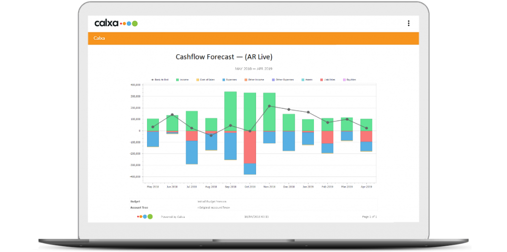
Cashflow Forecast Chart
One of the most useful tools in your kit. Cashflow is the key to any organisation, so it’s important to forecast and develop solutions to increase or maintain a healthy cashflow.
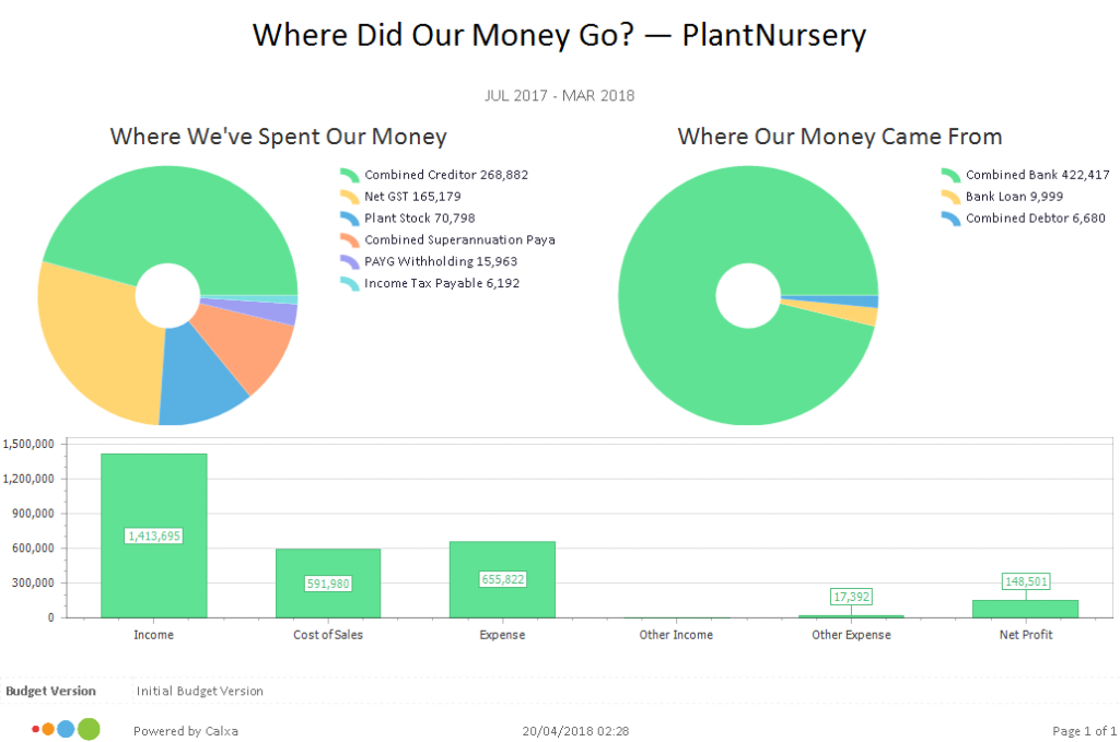
‘Where Did Our Money Go?’ Chart
As the name suggests this chart is a winner to answer this age old question. This report includes not one, but three charts to show exactly where your money is going.
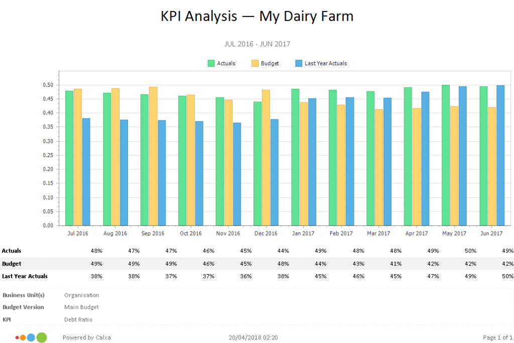
KPI Spreadsheet Chart
This chart is very versatile. Either compare Actuals, Budgets, Last Year Actuals and Last Year Budgets for the last 12 months on any of our standard KPIs or your own custom KPIs.
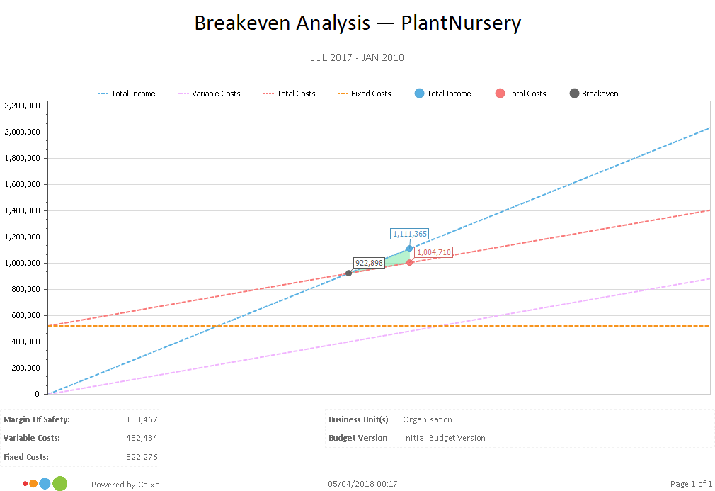
Break-even Analysis Chart
Knowing your break-even is an essential part of the sales cycle. With that in mind, use this chart to see the revenue required to break-even and your current margin of safety. Then start the conversation from there.
Reporting: Columns & Rows
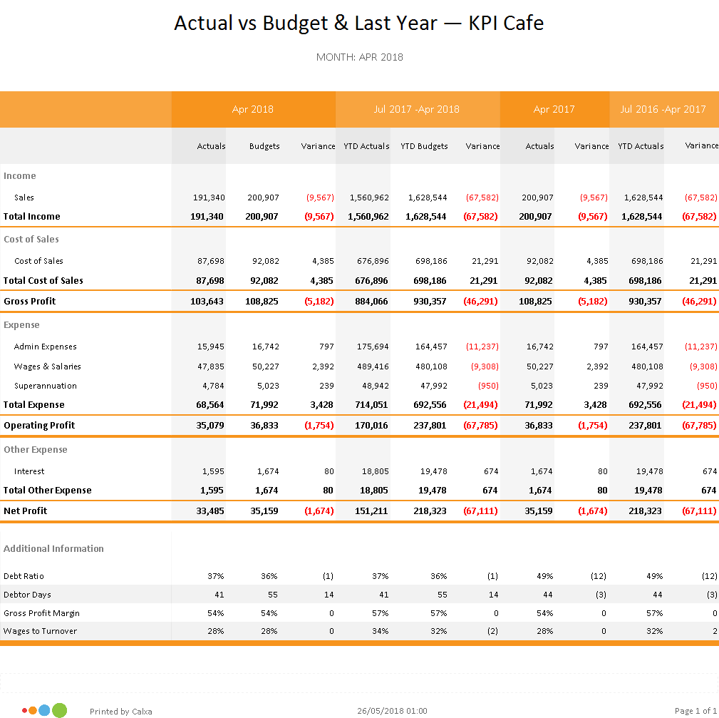
Budget Summary Report
The Budget Summary Report, is one of the best reports for measuring your past performance, comparing actuals and budgets for a selected period of time.
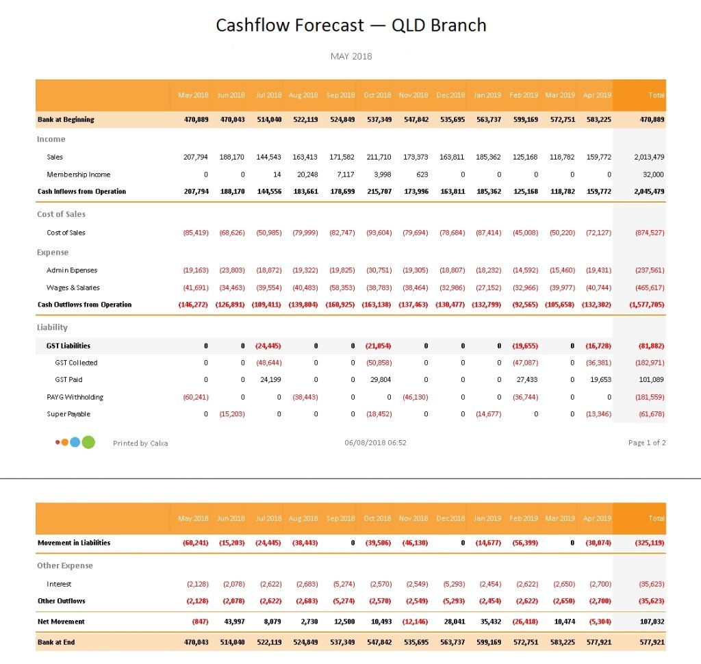
Cashflow Forecast Report
Forecast cashflow and avoid a cash-crisis before it becomes a crisis. If you need more detail than provided by the chart, utilise this report to clearly understand where and how your cash is forecasted to move throughout your business.
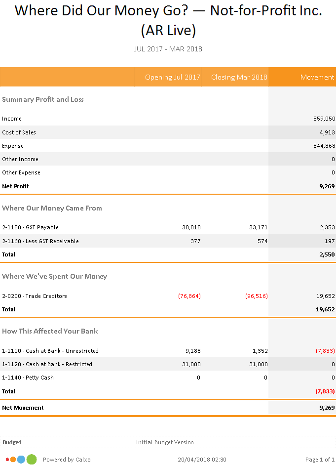
‘Where Did Our Money Go?’ Report
This report provides clarity in understanding the link between your Profit & Loss Statement and your Balance Sheet. Again use the report version if columns and rows are preferred.
More bang for your buck
Another impressive feature of Calxa is the ability to design your own reports. If the default list of reports are not exactly what you need and you want to rearrange the layout, add an extra column or even go so far as to calculate your own custom field, Calxa has the tools. The best part, we have a webinar recording ‘Design your own Reports’ that shows you how to do it.
What ever you may need, Calxa has you covered. Starting the conversation may be hard, but we are here to give you the reports and the numbers to create a solid foundation to all of your discussions, even if it is just to reinforce that you are doing a good job – its always good to know.
