When your board, your boss or your clients ask you to give them some dashboards, where do you start? We know you could create something in a spreadsheet but that is so 1990s! In the 21st century you need an app that connects to your accounting system. This article focuses on Xero reporting dashboard tools, but most of these tools connect to other systems as well.
Selecting a Reporting Dashboard Tool
Dashboards, as opposed to reports, are generally a set of charts displayed on one screen or one page. Each chart is usually designed to give a snippet of information so that the whole dashboard together gives a rounded view of a topic.
We have focused in this article on apps that provide customisable dashboards. A good dashboard should give you a choice of chart types, flexibility in laying them out and displaying them. And, most importantly, it should provide a choice in what data to display. It is not enough to just show total Income, for example. Sometimes you want a particular income line or a particular expense line. Alternatively, you want to compare it to budget or compare it to a previous year.
As well as accounting data, you may also want to include:
- Non-financial metrics on your dashboard
- Or combine the 2 with KPIs such as Average Transaction Value.
With this in mind, we have reviewed some of the most popular dashboard apps for Xero users to help you choose which one might suit your needs best. We haven’t ranked them in any way because everyone’s needs are different. The article should point you in the direction of a reporting dashboard tool that fits your individual requirements.
For those of you that prepare dashboards for clients, make sure you can share them easily and securely.
The Xero Reporting Dashboard
It would be remiss of us not to include the Xero dashboard. Ultimately, it may be enough for your needs. The standard Xero Dashboard is fairly simple. Its focus is mostly on:
- Bank accounts,
- Payables,
- And receivables.
For day-to-day use, that’s a good start for many people but it’s not quite what you want for management reporting. For a few extra dollars you can add the Business Snapshot dashboard and that gives you a little more choice over what to display.
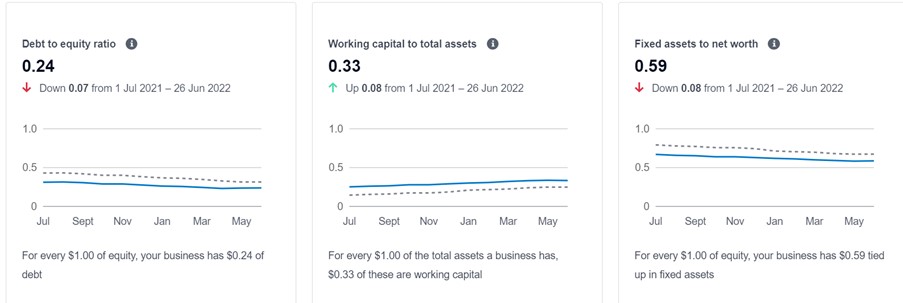
The Business Snapshot dashboard has a range of useful ratios as well as charts on your income, expenses and profit. It’s a good starting point if you’re new to dashboard reporting but you’ll probably soon want more.
Dashboard Insights
In some ways, Dashboard Insights are the opposite scale to the Xero Dashboard. There is not much to learn because they do all the work for you. They are not so much providing a dashboard reporting tool in the traditional sense as a custom-built set of dashboards to suit your needs. They will meet with you to discuss the scope of your project, clarify exactly what output you want and then they will build the dashboard to suit. This process is then repeated for each client’s reporting.
This is the solution for those who don’t have the time nor want to learn how to do it themselves but still need something that will impress. Dashboard Insights is currently available for users in Australia and New Zealand.
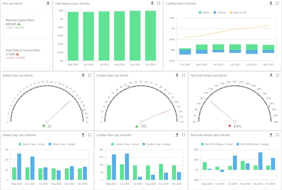
Reach Reporting
Reach Reporting is an automated spreadsheet that you connect to your Xero data and other systems like QuickBooks Online. As such, it has all the strengths and weaknesses of any spreadsheet. After you’ve connected, it gives you a couple of sample dashboards and then you can create your own from there. Once you get started there is some comprehensive filtering options and a range of chart types. You can work with any of their templates or you can start from scratch and select the accounts and date ranges that you need.
Reach Reporting works if you’re in the US, Canada or Australia. Other countries are apparently coming soon. It’s built on a spreadsheet platform rather than a more robust database but that does give you the ability to add data rows and use familiar formulas.
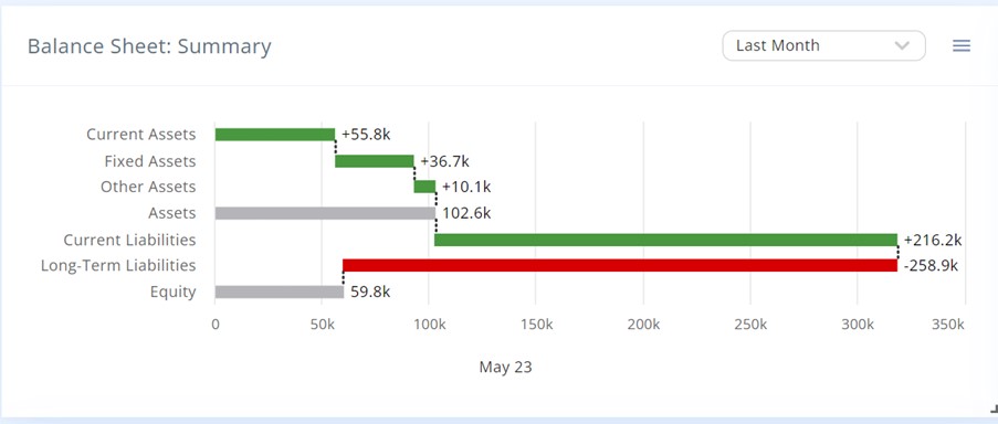
Calxa
Calxa’s dashboards were built on 20 years of experience with reports and charts. There are some preset dashboards to get you started that will suit many users. You can copy them and make small changes or you can start from scratch and customise exactly the set of charts you need for your purpose.
For those who want it all, you can choose from pre-defined data sources or you can choose any sets of accounts, KPIs or Metrics. You can compare these across multiple years or break down your data by organisation or business unit.
We recommend starting with one of the built-in chart templates which in many cases will do the job. Power users, though, can completely customise the charts and dashboard to display the information they need. Calxa dashboards work for Xero or QuickBooks users anywhere in the world.
Futrli
In their earlier incarnation as Crunchboards, Futrli were the first to offer dashboards for Xero users. Their focus these days is more on “AI-Powered” short-term cashflow forecasts, however, there are still some dashboards to be found. There is a selection of preset dashboards. With some patience and time, you can work out how to customise them to your needs. A tip, watching the training videos will help.
Choosing the right Reporting Dashboard Tool
The right dashboard for you is the one that gives you the information you need to run your business better. It needs to be easy enough for you to get that information, Even if that means having someone else do the setup for you. If you want detail, or you want something complex, choose a reporting dashboard tool with the flexibility you require. Make sure you can get good help and support when you need it as your needs are sure to develop with time.
With the right app and setup, dashboards can be a great addition to your reporting toolbox.