
New in Calxa this month, we gave you the power to add your own colours and branding at a global level. Apparently, not everyone is a fan of orange! Previously, you could take a deep dive into the Report Designer and format each template the way you wanted or needed. Now you can change the colours to suit your own style and brand across all reports.
Global styles will allow you to change formats:
- Add a logo
- Choose your corporate font and colours
You can then apply this style to the report you are editing in the Report Builder.
How Do Report Styles Work?
This will be totally new in Calxa. You will find Report Styles under the Report Tools menu. You can create as many styles as you need and set any one of them as your default style. The default style will be used on any new reports you create.
The main components of a style will include:
- A Primary Colour
- Secondary colour
- Your Logo
- Type Font
- A Chart Palette
Besides providing 3 options for the chart palette, you will have the option to create any set of colours that you wish. You can select colours by picking them or by entering the Hex number.
Custom Headers and Footers
Our default header layout puts the logo at the top right and the report title to the left. We’ve done this to ensure that all the report templates line up correctly and you don’t get issues with merged cells on export to Excel.
However, if you have some experience with our report designer, or you’re happy to learn, you can customise the header and the footer to suit your needs. You can put your logo to the left, in the centre or anywhere you like.
Using Report Styles on Reports Are New in Calxa
When configuring a report, the style will start from the one you have chosen as the default style. In the Display Settings at the bottom left you can then choose any other Report Style.
![]()
If you’re an accountant, you might create styles to suit your practice colours or those of your clients. You’ve now got choices and you can easily create the styles you need.
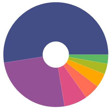
Chart Palettes
Charts, especially the pie charts, contain more colours than the reports so we’ve prepared 3 default palettes you can choose from and then customise them to show the colours you prefer. When you customise the colours, they will be used from right to left in the charts.
We hope you’ll enjoy your reports now in your own colours! Let us know what you think.
More Reporting Improvements
Next up, in just a few days, we’ll add the option to shrink rows on reports. This will give you more rows per page and you will have the option to shrink them by 90-50% to suit your needs. If you like a more compact look, this is for you.
And for those of you customising the header of your reports, we’re splitting the Report Header field so that you can:
- Place the title and the company name separately,
- Or, omit one of them.
We hope you’ll enjoy your reports now in your own colours! Let us know what you think.
What’s Next?
Our team is also working on Advanced KPIs and started on Custom Dashboards. There are still some challenges to be overcome before testing can start on these new features later this month. These are just some of the changes coming up.
To find out more about Calxa’s new features, go to our Product Info articles or check out our change log.